The truth about Gantt charts
So if time focused charts were not ‘Gantt charts’ what were they and how did Gantt’s name come to be associated with bar charts that were invented a century earlier by William Playfair?
The association can be traced to a book by Wallace Clark The Gantt chart, a working tool of management, published in 1922, three years after Henry Gantt’s death. This book is the reason Americans, in particular, refer to bar charts as Gantt charts and others have simply followed American academics without researching either Clark’s book or the wider literature.
The ‘Gantt charts’ described by Clarke and used by Henry Gantt are numerous and various. A key skill Gantt had was the ability to fashion a chart to make complex data understandable and accessible. The primary charts used by Gantt in his industrial work during the First World war (1917–1918)—first at the Frankford Arsenal then on America’s entry to the conflict at the Ordnance Department in Washington, supporting the work of General William Crozier—focused on charting the difference between promises and performance.
Work planned and work performed is shown in relation to each other and in relation to time. The style of these charts is different, but the information is precisely the same as plotting Earned Value and Planned Value in a modern EV system.
Real Gantt charts
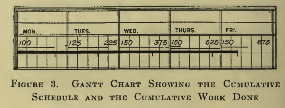
The real ‘Gantt chart’ was a major innovation plotting the planned work for a person or machine on a day against the actual production on each day and the cumulative production within a week or month. By clearly showing the actual performance (facts) in relation to time, effective management decisions could be made with respect to future work on the item being plotted. Clark claims this innovation was “the most notable contribution to the art of management made in this generation”—I’m inclined to agree.
The core elements of the ‘Gantt chart’ are:
- The need for a detailed production plan
- The planned quantity for each day plus the cumulative quantity (as values)
- The actual amount produced on a day as a proportional line within the day
- The cumulative produced as a thick line within the week
Above: A section of a ‘real’ Gantt chart showing planned production per day and the cumulative total (numbers), the % production achieved each day as a thin line (Thursday achieved more than planned) and the cumulative total for the week (thick line).
The charts were filed in a binder so historical information was easily available. This type of chart completed the three basic types of ‘Gantt chart’ developed by Henry Gantt during his career.
- The Man and Machine Record Chart showed what could be accomplished and what was accomplished by a person or machine in a day, which was central to Gantt’s production bonus system.
- The Layout Chart and Load Chart were used to plan the work through a plant to avoid idleness, focus the foremen on the important work each day, and plot the amount of work in hours or days ahead of the plant or any section of a plant (the backlogs).
- The Progress Chart plotted actual performance against the plan.
In combination, these three charts provided an efficient tool to measure and manage the efficiency of industry and were used widely in the US Government’s war effort. After the war they were quietly dropped as bureaucrats preferred to focus on what that they had done, rather than compare this with what they could have done.
Henry Gantt was an important figure in the development of scientific management and one of its offshoots, modern project management, but he is recognised today for all of the wrong reasons. I hope this post will help correct the story!


